Design Efficient Keyboards for TV
TV Virtual Keyboard Design for less annoying too much button press
Keyboards on today’s smart TV screens emulate the keyboards on computers. The problem with this, however, is that computer keyboards were designed for two free-moving hands; typing is restricted on TV screens because instead of typing with two hands, one must constantly move a “focus” to type.
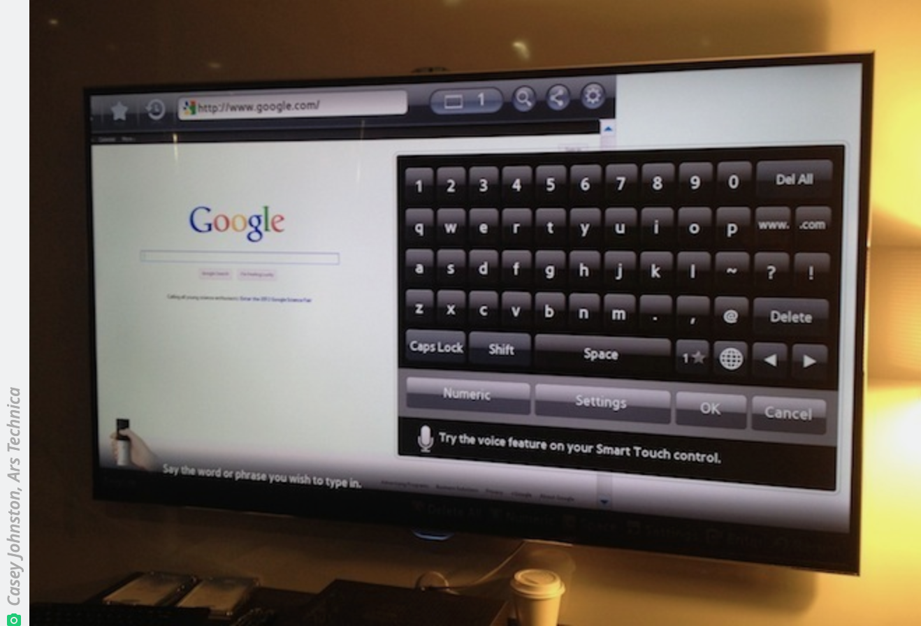

As mentioned, the two devices use identical keyboards even though you cannot physically “type” on a TV as you can on a computer.
The keyboard on TVs is quite inefficient because one must constantly move the key focus. To combat this problem, we have tried to come up with a more TV-oriented keyboard so that movement between keys is minimized.
We started out with Korean keys. Here is a picture of what the Korean keyboard looks like:
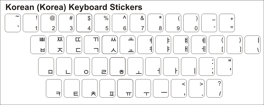
Simulate how many keys are pressed with test phrase
The first thing we did was create a simulator http://pxdlab.kr/tvkeyboard/ that allows designers to create their own keyboards and type in test phrases to see on average how much the focus would move according to the words inputted.
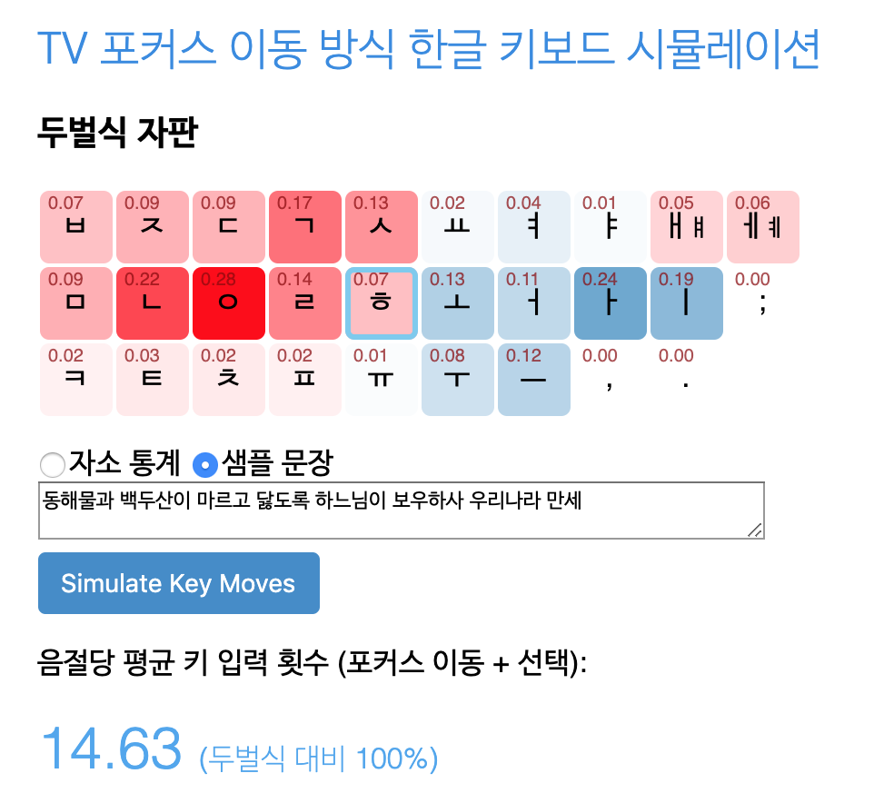
We designed the keyboard such that you can see the focus move and click as it would if one were to actually type on a TV keyboard.
General Evaluation with Frequency Analysis of Korean letter pairs (initial-medial-final)
After building the simulator, we built two programs for analysis so that we could more definitively see which keyboard was most efficient. Before building the programs, we collected tens of thousands of Korean tweets using the Twitter API (1,737,295 words). We hoped that this large sample would provide us with reliable information as to the most commonly used characters in the Korean alphabet. We then built our first program, which was used to make frequency tables using the tweets. For every character, the frequency tables told us the probability of each character and the probability that each of the other characters preceded that character. You can find them in this link.
Our second program then reads in an file specifying a keyboard layout and then outputs a number representing the “score” of the keyboard (the lower the better as it signifies that the focus moved less). To calculate this number, we took the sum of each character and its multiplication with the probability it was pressed by the multiplication of the probability of each preceding character and the manhattan distance of the preceding character to the original character. We gained these probabilities through the frequency tables created by our first program. More simply, here is a very basic pseudo-code of calculating the number. Of course, the real code was more complicated but this gives a general idea:
total = 0
for char in table:
     for i in range(52):
          total += distance(i, char) * prob[char] * prob[(i | char)]

# numbers 0-51 signify a specific Korean character (values of variable i)
# i | char signifies character i given that char was already pressed
Design Iteration by hand
With these two programs, we decided to test some keyboard layouts. With the standard Korean keyboard (2beol), we got a score of 14.63, which is quite high. We then created some of our own keyboards and reduced that number to 8.98 (61% of the original score), using a keyboard we named sandwich3 (http://pxdlab.kr/tvkeyboard/#sandwich3).
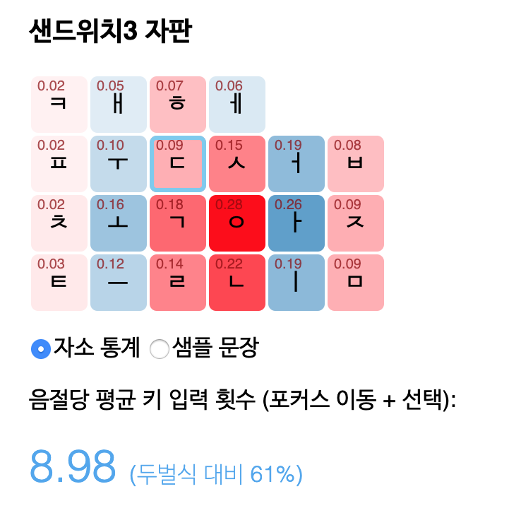
When building different programs to test which ones were most efficient according to our programs, we first tried the “CJI” layout since it minimizes the number of physical keys http://pxdlab.kr/tvkeyboard/#cji.
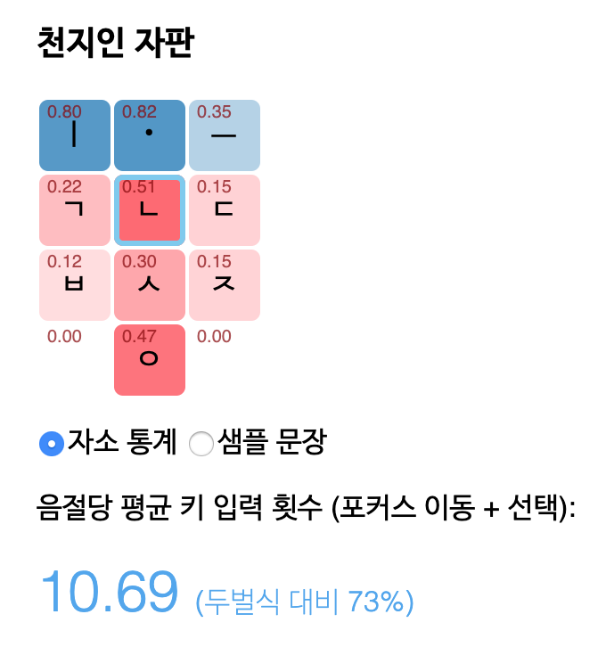
This layout and many of the other keyboards we constructed with the same idea yielded numbers significantly lower than the original 2beol keyboard when tested on with our program. The lowest number we got from this design was 9.62(66%) from pkb5 http://pxdlab.kr/tvkeyboard/#pkb5.
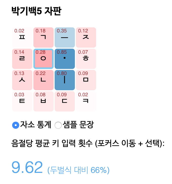
However, we also found out that less keys meant more pressing of the buttons to type in the same characters so we constructed another design called “Universal Sandwich” http://pxdlab.kr/tvkeyboard/#universal_sandwich. This improved our number to 9.03 (94% of the previous score). We continued tweaking this key layout until we made "sandwich3" as mentioned above.
Let the Machine design it with a Genetic algorithm
After building the different keyboards on our own, we wanted to see if we could further improve our performance. We, therefore, implemented a genetic algorithm for optimization. To summarize, the algorithm generates an initial “population” of 500 random keyboard sequences. Then, using probabilistic methods favoring keyboard sequences with low movements, we selected two parents who would then mix keys to create an “offspring”. We also gave a small chance that this offspring would have a mutation (for added diversity). We ran this algorithm until the general population converged, meaning that they stopped producing offspring that were better than the average of the population. Link 1 and Link 2 were useful resources for us when figuring out our implementation.
After running this program, we got keyboards like this: http://pxdlab.kr/tvkeyboard/#firstTest.
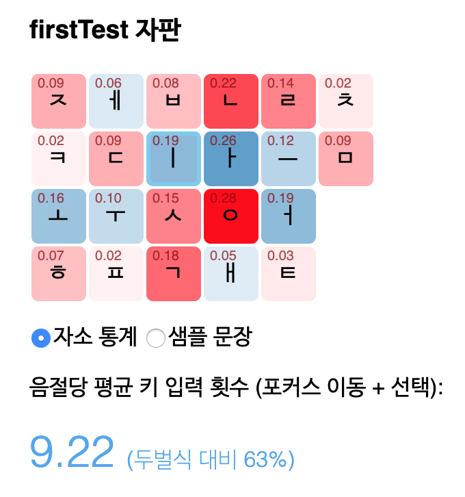
They yielded quite good results; this keyboard has a score of 9.22. However, they took a lot of generations (offspring) to converge. For example, this keyboard took 32,691 generations to converge. Furthermore, while the results were good, they scored worse than some of the ones we had already created. Therefore, we decided to enhance our algorithm.
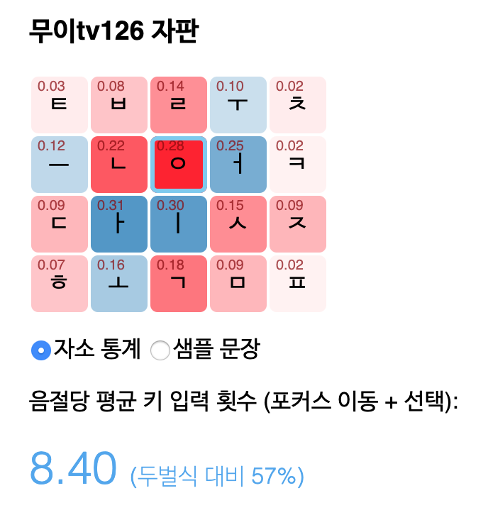
Instead of selecting parents from the general population, we decided to select parents from only the top 10 percent of the population. That way, we would only produce offspring with traits that are already deemed desirable. With this method, we got our best keyboard so far: http://pxdlab.kr/tvkeyboard/#best. On our calculator program, this keyboard scored 8.89 (61% of the score of the original Korean keyboard).
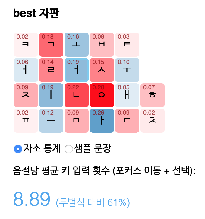
When we remove ㅐ,ㅔ and use only 6 vowels, it might be a little bit clumsy to type ㅐ with ㅏ+ㅣ but that keeps the key matrix smaller and gain efficiency in overall. http://pxdlab.kr/tvkeyboard/#mue126_hanson
Efficient and Easy to learn
While we were able to attain a keyboard with a great score, we also knew that a great score does not always translate to a good user experience. This is because the keys may be scattered with no apparent rule such as keeping all the vowels together. As apparent from above, the keys seem to be put in arbitrarily without any sort of guideline. We wanted to improve this confusion because it would seem more intuitive for the users; we were confident that even if we attained a worse score, the user would see a net benefit since the keyboard would be more intuitive.
To fix the problem of a messy looking keyboard, we ran our enhanced genetic algorithm multiple times. We then examined the best keyboards and looked for patterns. Some of the patterns we noticed were:
-
Less frequently used keys were on the perimeter
-
‘ㅇ’ and ‘ㄴ’ were always close (no more than 2 steps)
-
‘ㅇ’ and ‘ㅣ’ were always close (no more than 2 steps)
-
‘ㄴ’ and ‘ㅏ’ were always close (no more than 2 steps)
-
‘ㄱ’ and ‘ㅏ’ were always close (no more than 2 steps)
-
The most frequently used keys were usually found in the medial columns (columns 2 through 4)
-
Most keyboards had four rows; a few had 5
-
‘ㅇ’ and ‘ㅏ’ were always close to the starting focus (no more than 2 steps)
-
‘ㅇ’, ‘ㄴ’, ‘ㅏ’, and ‘ㅣ’ were always near each other as a cluster.
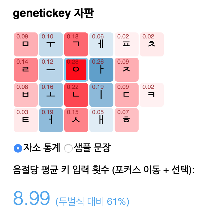
Keeping these patterns in mind, we constructed our own keyboard so that it was more intuitive; we kept each column a strictly vowel-only or consonant-only column. Here is our final keyboard which scored an 8.99 on the calculator (only 0.6266% more than the highest scoring one produced by the enhanced genetic algorithm). Here is an image of this keyboard:
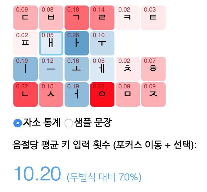
We also tried to code our genetic algorithm to favor keyboard layouts where the vowels were close to each other. However, they scored less than our keyboard above. An example of a keyboard produced by the modified algorithm can be seen below (scoring a 10.20):
You can find more results from the genetic algorithms here. The sheets display the changing scores of the keyboards on a scatterplot to see the overall improvements of the keyboards as made by the algorithm.
Design Efficent English keyboard
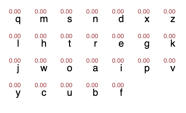
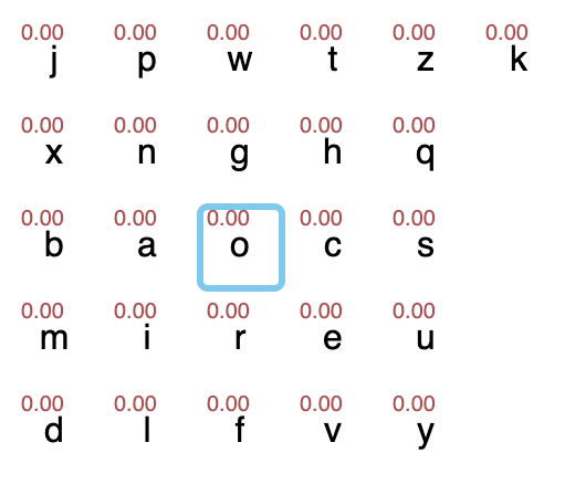
The final part of this project was finding an efficient keyboard layout for the English alphabet. This time, we did not have to create our own frequency tables since they were available online. We got the frequency of each letter from Wikipedia and the frequencies of characters coming after another character from Github. From these sites, we developed a similar genetic algorithm as above to try and find the most efficient English keyboard. You can see their progressions via the algorithm on the same sheet as above. Our best keyboard scored 3.38 and is shown below.
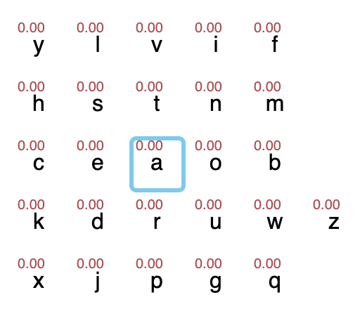
For comparison, the original qwerty keyboard as we use on our computers scored a .8902 so we achieved a score of 0.6914 of the original score. As with the other trials, we noticed a few patterns on the English generated keyboards: the less-used characters were put in the perimeter, the vowels were usually close to each other, and the layouts were composed of either four or five rows. You can see some of our best English keyboard layouts below:
Don't put new wine into old bottle
This project taught me a lot. The most challenging part for me was figuring out how to convert each Korean word to the characters that make up that word since this is necessary to compute the distances traveled for any input of words (whether that be for the website or from the tweets). Korean characters are constructed using what are called “jamos”, which make the Korean alphabet (ㄱ,ㄴ,ㄷ, etc). These all have individual Unicode numbers assigned to them. However, so do the words such as “가”, “뇽”, and “워” so I needed to write code to take those words and deconstruct them into their individual jamos. Luckily, I was able to find an algorithm from page 142 of Unicode Standard/the Unicode Consortium and implemented it using code (http://www.unicode.org/versions/Unicode9.0.0/ch03.pdf). After successfully writing the algorithm, the rest of the project went quite smoothly.
After completing the project, we are convinced that using the same keyboard layout meant for computers (10 fingers) for TVs/devices that require a single focus is not efficient. Through our programs, we were able to find keyboards that required much less movements to type than the traditional keyboard we have today. While keeping this in mind, the only part we were not truly sure about was the general acceptance of such keyboards. Because most people are used to the keyboards they see on their computers, perhaps switching to a completely new layout may be irritating and confusing to them. In order to be sure that our modified keyboards provide the best user interface, it is necessary that we test on different users and gain their feedback. But for now, we can be sure that our keyboards would reduce the number of button-pressing on TVs.
Leanux lab에서 예전에 한글 자소 빈도를 고려한 자판을 만들었는데요. 모바일에서 두 손(엄지) 사용을 고려해, 자음과 모음을 왼쪽 오른쪽 양손이 분담해 교대로 입력하며 운지 거리를 줄이도록 배열해 입력 효율을 높였습니다. 그런데 몸이 불편해 한 손으로만 입력하거나 TV 환경에서 리모컨 방향키나 모션 리모컨으로 커서를 이동하는 경우 좌우를 계속 왔다 갔다 해야해 오히려 불편합니다. 아예 빈도가 높은 자소를 가운데로 몰아넣으면 이동 거리가 짧아져 입력이 편해지는데요. 자소 빈도와 더불어 각 자소쌍간의 빈도까지 고려하면 보다 효과적인 자판을 설계할 수 있습니다.
지난 여름, 미국 대학에서 Computer science를 전공하는 박기백 님이 pxd에서 인턴을 하게 되어 5주간 함께 자판을 디자인했습니다. 약 2백만자의 한글 문장을 수집해 한글 자소쌍간 빈도를 분석하고 통계적으로 자판의 평균 입력 횟수를 계산하는 평가 함수를 만들었습니다. 예를 들면 '한글'에서 ㅎ-ㅏ, ㅏ-ㄴ, ㄴ-ㄱ 등 초성, 중성, 종성 자소가 연이어 오는 자소쌍 빈도를 구하고 자판에서 각 자소간의 이동 거리와 자소의 빈도, 자소쌍 빈도를 곱해, 모든 경우를 다 더하면 평균 키 입력 횟수를 구할 수 있습니다.
손으로 일일이 자판을 조금씩 고쳐가며 더 점수가 높은 자판을 만들다가 컴퓨터가 진화알고리즘을 통해 더 효과적인 자판을 설계하도록 했습니다. 물론 입력 효율은 높지만 자음 모음 배열이 불규칙적이어서 학습하기는 어렵습니다. 하지만 손을 움직이는 것보다는 눈을 움직이는 게 더 수월하니 실제 입력은 훨씬 편합니다.
모든 프로그래밍은 박기백님이 작성하였고 정리가 되면 오픈소스로 공개하기로 했습니다. 결과물인 입력 효율을 고려한 TV용 한글 자판은 CCL로 공개할 예정입니다. 효율만을 고려하면 두벌식 자판에 비해 구글단모음은 84%, 천지인은 73%, pxd 안은 57%로 줄일 수 있습니다.
- 無異